How to Choose Undertones in Paint Colors for Perfect Room Harmony

Picking the right paint color for your home is no easy task, and it gets even trickier when you throw undertones into the mix. Whether you’re freshening up your living room colour combination, planning a dreamy wall painting in the bedroom, or revamping your overall house interior design, understanding undertones is key to creating a cohesive and harmonious look.
But don’t sweat it! We’re here to make sense of undertones in a way that doesn’t make your eyes glaze over. Let’s get started on how to master paint undertones, so your spaces feel balanced, inviting, and ready for compliments.
What Are Undertones?
Before we jump into the nitty-gritty, let’s clear up what undertones even are. Undertones are the subtle hues beneath the main color of the paint. For example, a gray paint might lean slightly blue (cool undertone) or even brownish (warm undertone). These undertones might not be obvious when you first see the paint, but trust us, they’ll show once you get the paint on the wall.
Think of undertones as the personality of the paint color. Two creams might seem identical in the store, but one could have a yellow warmth while the other feels more peachy. Knowing how to spot this difference will make sure your home doesn’t look unintentionally mismatched.
Tips to Choose Undertones Like a Pro
1. Consider the Room’s Purpose
When selecting colors for a space, ask yourself how you want the room to feel. Cool undertones (like blues, greens, and grays) tend to create a calming vibe, making them perfect for a wall painting in the bedroom. Imagine a soft gray with just a touch of blue for a serene and relaxing space.
On the other hand, warm undertones (yellows, oranges, and reds) are cozy and inviting, ideal for more social areas like the living room colour combination. A beige with a golden undertone, for example, can make the space feel instantly warmer.
2. Check Lighting First
Natural light plays a huge role in how undertones read in a room. Morning sunlight can make warm colors feel even warmer, while cooler tones might balance out the brightness of midday. On the other hand, a darker corner might emphasize a paint’s undertones in surprising ways.
Take a paint swatch home and tape it to your wall. Look at it during different times of the day to see how its tone shifts with the light. For a cohesive house interior design, repeat this process for every room.
3. Match Undertones to Fixed Finishes
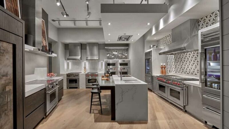
Your wall color doesn’t exist in a vacuum. Check the undertones in your flooring, cabinets, countertops, and even large furniture like a sofa. If your kitchen has cool-toned white cabinets or a marble countertop with gray veining, matching the undertones with your wall paint will tie the room together seamlessly. For instance, a cool gray on your walls can complement the marble perfectly.
At the same time, if your floors have a warmer, earthy vibe (like reddish wood or caramel-toned planks), pairing them with a warm beige will make the space feel cohesive.
4. Use Neutrals as Anchors
If you’re nervous about going too colorful, neutrals with the right undertones can quickly solve your design woes. For example:
- A warm greige (gray + beige) works beautifully for a living room colour combination with lots of natural light.
- Crisp, cool whites make for perfect wall painting in a bedroom if you prefer a minimalist, modern look.
Layer in accents, like pillows, rugs, or artwork, in similar or complementary undertones for added harmony.
5. Test, Test, Test!
Even the most trained eye can’t predict how paint might look without testing it on an actual wall. Before committing to gallons, grab sample pots of your top picks. Paint patches on your wall (preferably not too close to one another) and live with them for a few days. You’ll start noticing which undertones feel “right” and which don’t.
Friendly pro tip: Don’t test just one color. Test at least 2-3 options to compare how different undertones react to your space’s unique lighting and mood.
Real-Life Examples of Harmonious Undertones
- Living Room
Combining a warm off-white for the walls with beige or caramel throw pillows ties together a rustic hardwood floor and creates that cozy, picture-perfect feel. Add some greenery, and you’ve got a balanced space that works beautifully with warm undertones. - Bedroom
Pair a soft gray wall color with blue bedding for a tranquil retreat. Cool undertones here create a relaxing atmosphere, helping you sleep peacefully after a long day. - Kitchen
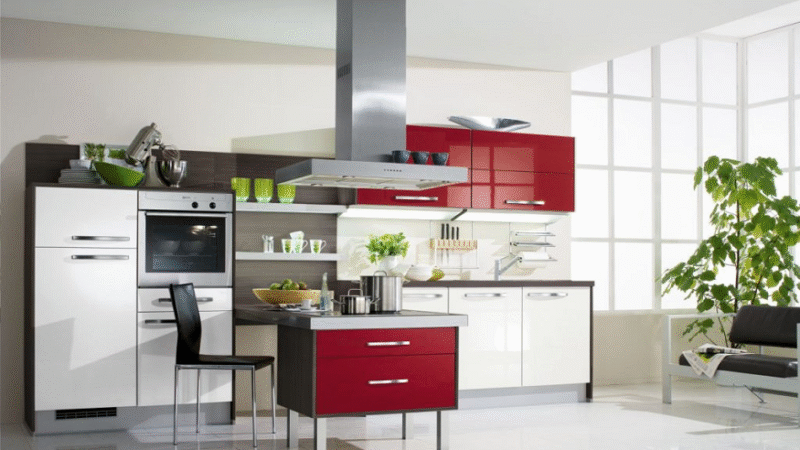
If your backsplash is loaded with warm tones (think golds or sandy browns), go for a creamy white or pale butter color on your walls to unify the space.
Wrapping It Up
Choosing paint colors doesn’t have to feel overwhelming once you know how to spot and work with undertones. Think about the mood you want, consider your room’s lighting, and match undertones with the fixed features already in your home. Most importantly, test your choices before making a final pick.
No matter if you’re tweaking a living room colour combination, upgrading your house interior design, or planning that new wall painting in the bedroom, your space will look more intentional and harmonious when you get undertones right. Now grab those swatches and start experimenting! Paint perfection is just a brushstroke away.